OutRunners
UI Design, Brand, Visual Design
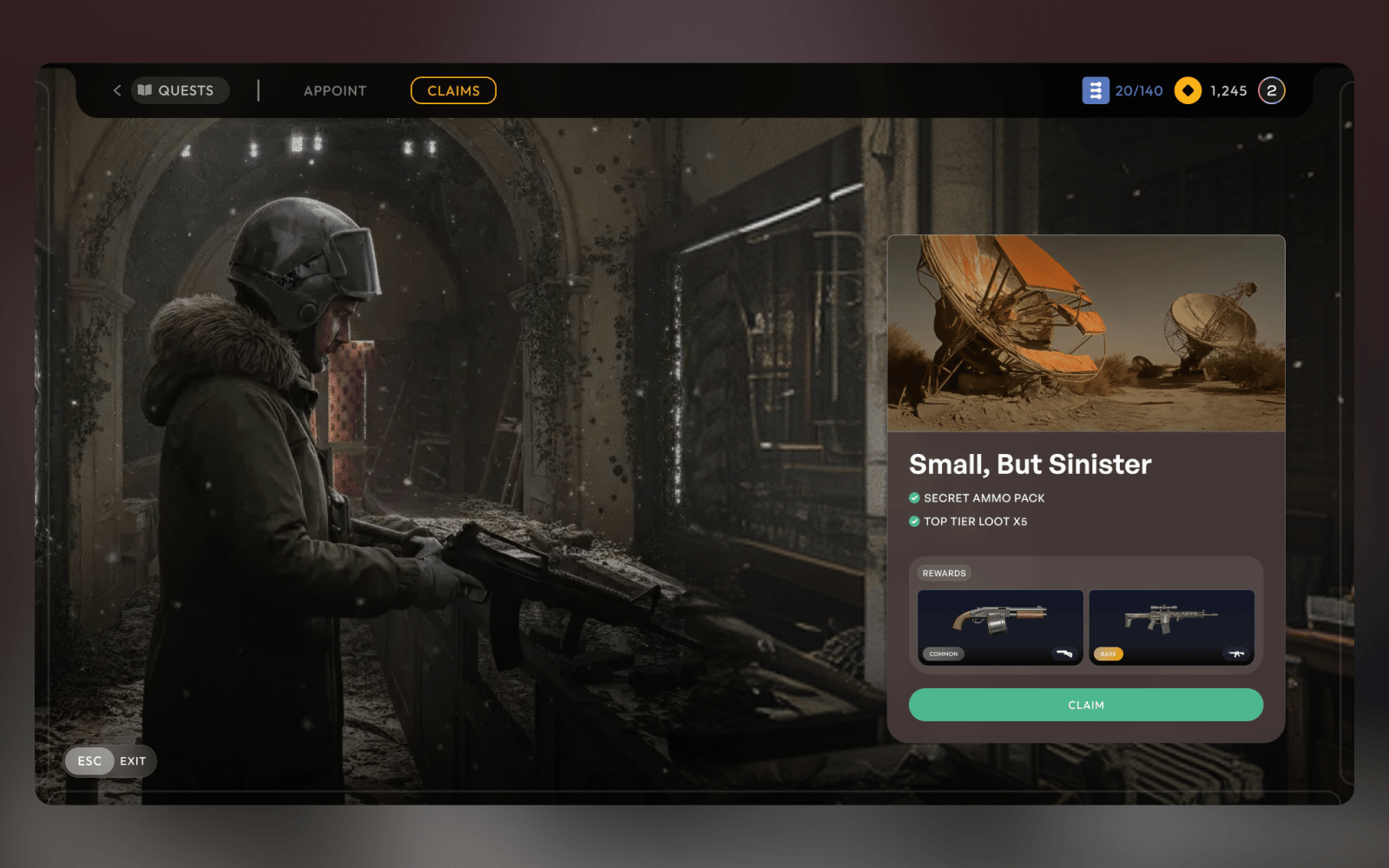
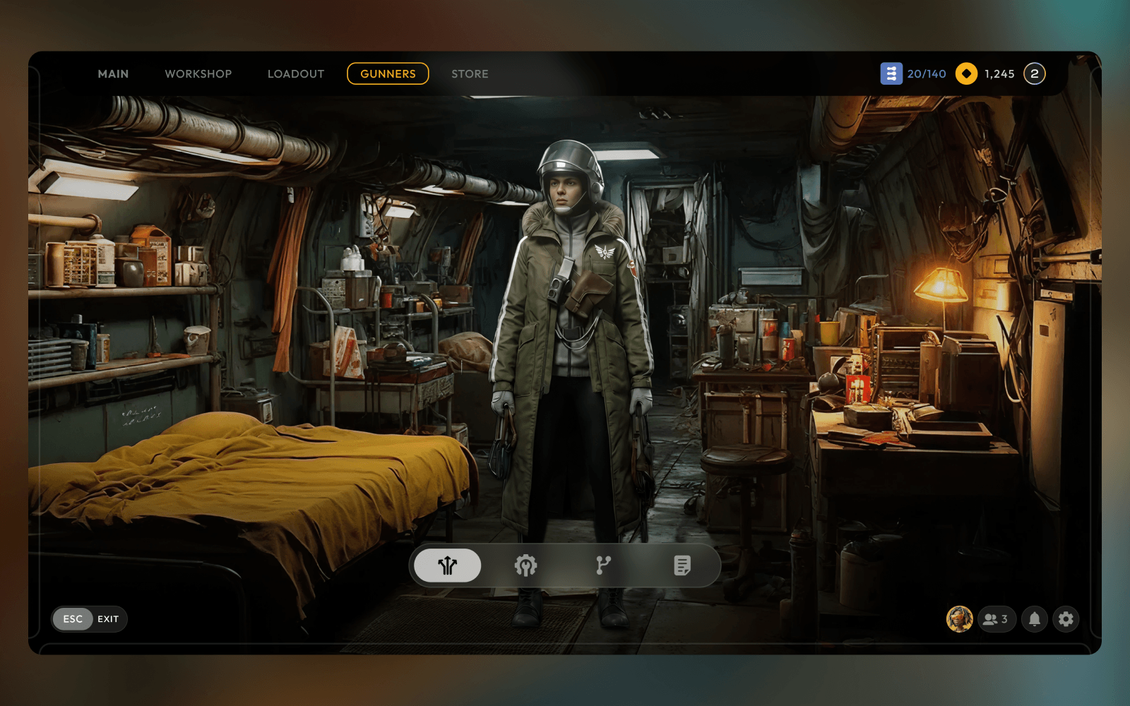
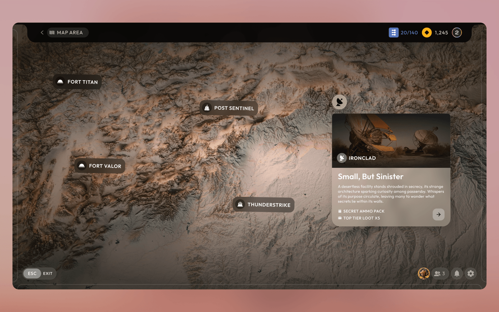
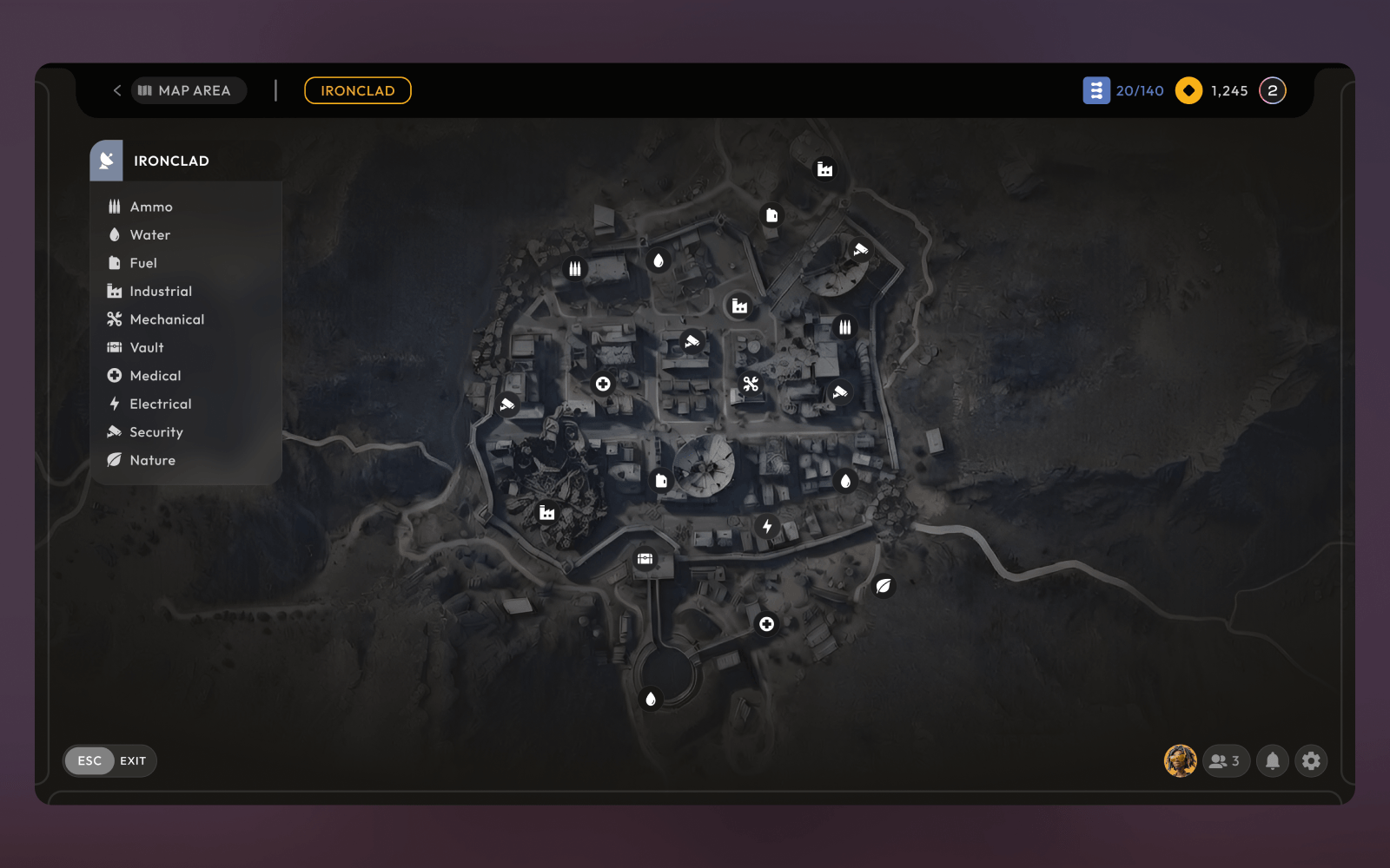
Beauty in the Rubble
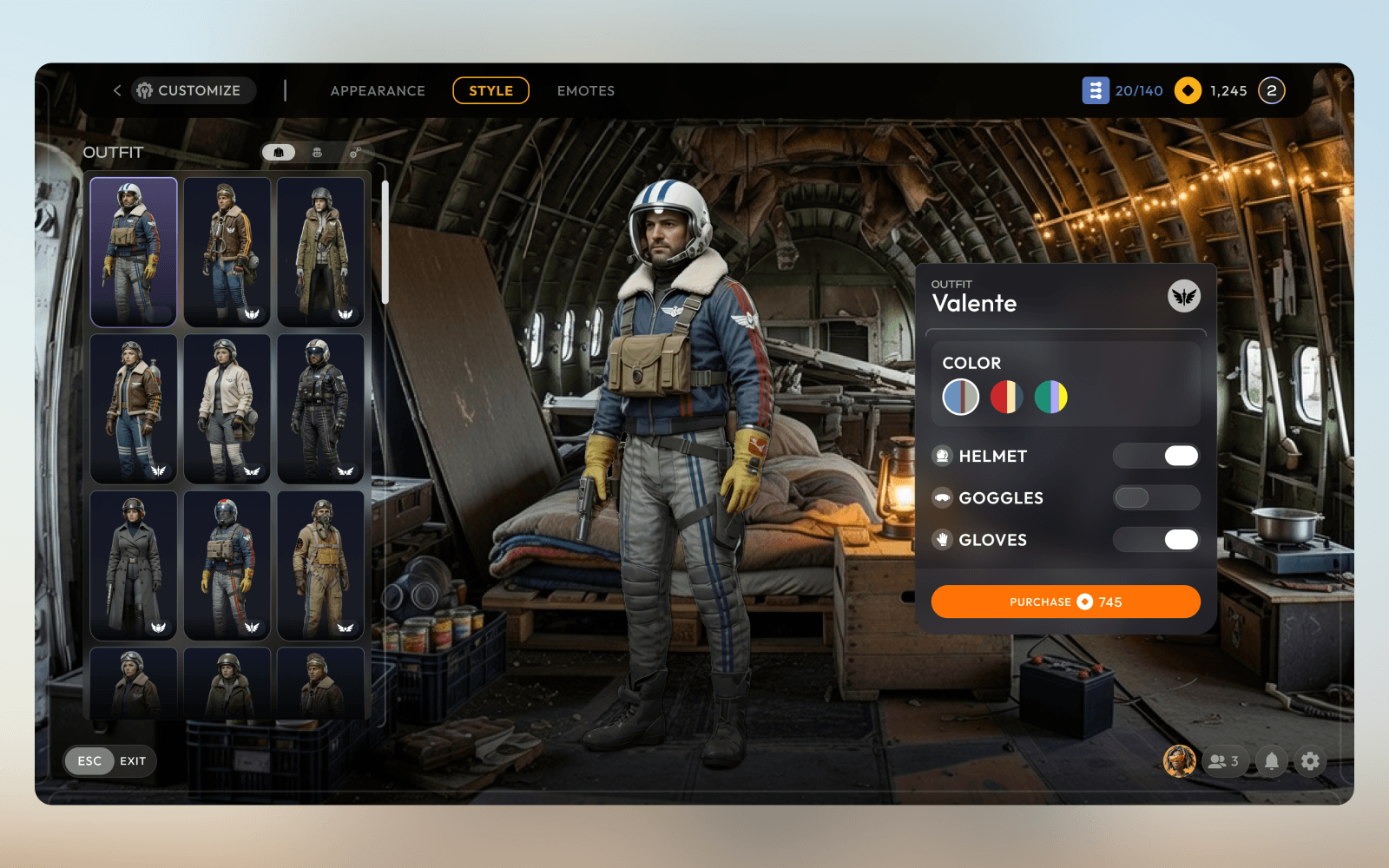
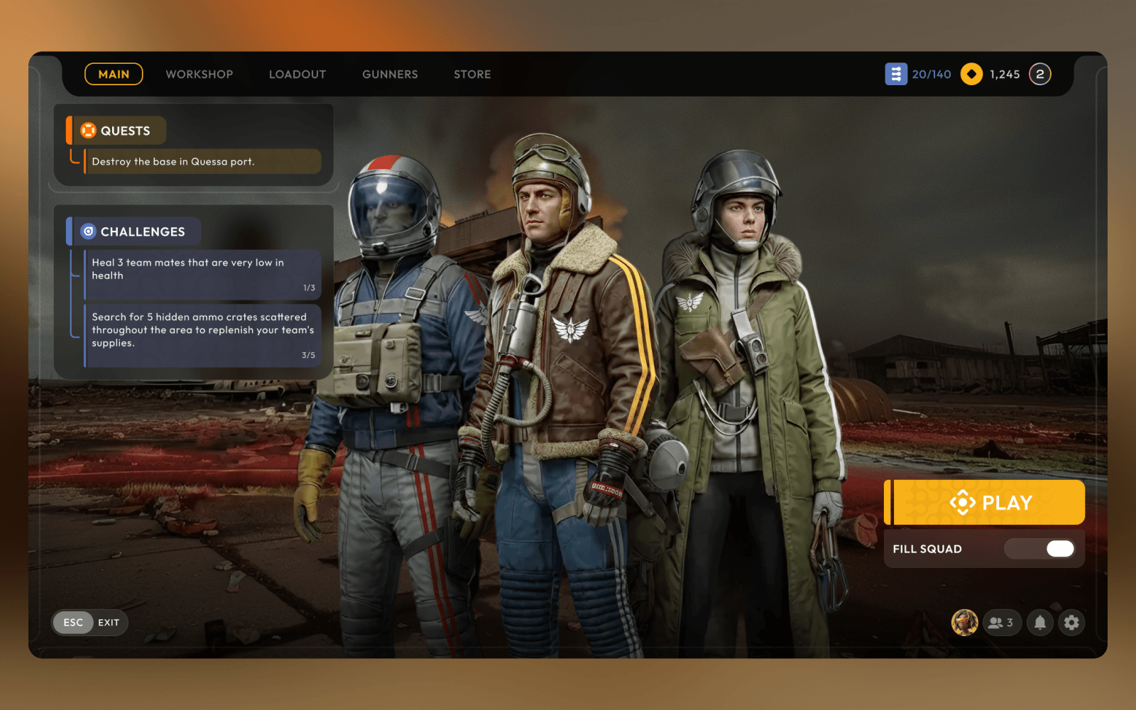
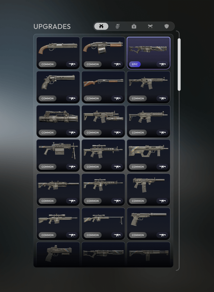
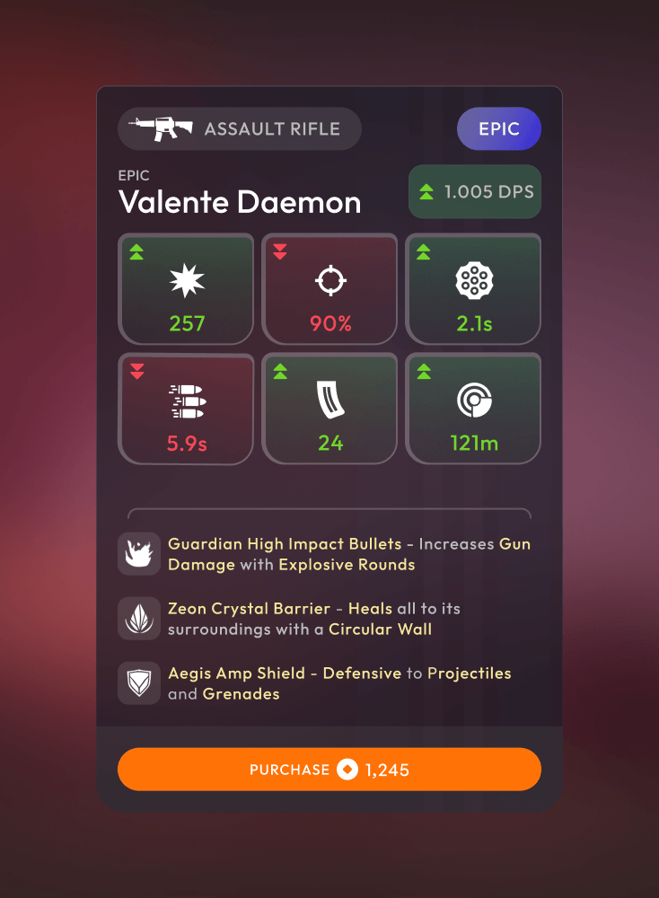
For this project, establishing a visual language that balances high-fidelity machinery with the rugged, tactile reality of a world under siege was a priority. Focusing on a "Functional Industrialism" philosophy, where the visual design created a feel like it was built to survive a war, not just look pretty in a lab.
Hopeful Desolation
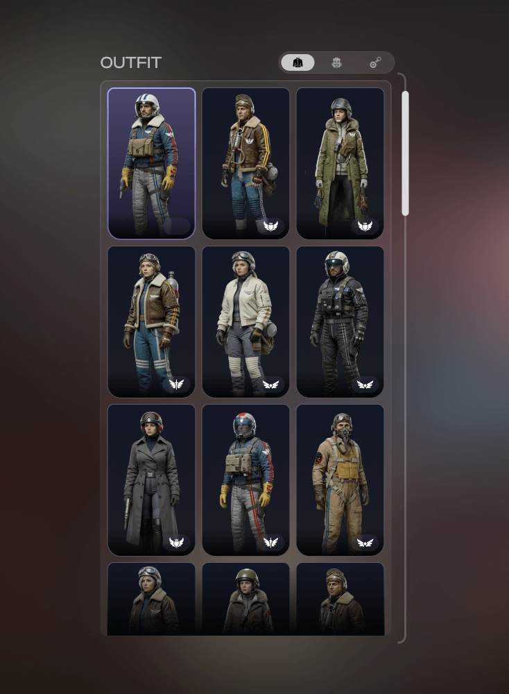
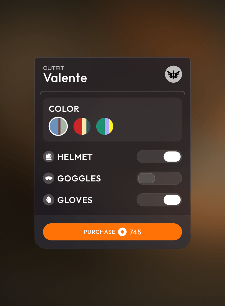
To capture the look and feel, an established specific color palette guide was created to ensure consistency across all visual assets. A base of desaturated "hazard" colors, think oxidized copper and slate greys.
more images coming soon!